


Art is a powerful tool in shaping the tone and energy of any workspace, and nowhere is this more crucial than in corporate environments. The right choice of art and color can subtly yet profoundly influence mental health, productivity, and even brand perception. At the intersection of color psychology and interior design, neutral colour paintings offer a versatile solution that suits the needs of commercial spaces—balancing visual comfort, professionalism, and contemporary style. In this article, we’ll explore the essentials of neutral colors, their psychological effects, and how these carefully curated artworks can elevate the atmosphere and function of executive offices, healthcare facilities, media companies, and more. Learn from expert advice, case studies, and get actionable recommendations for transforming your corporate office with neutral color art.

Table of Contents
- Understanding Neutral Colors
- Benefits of Neutral Colour Paintings in Corporate Spaces
- Expert Insights and Recommendations
- Practical Applications and Case Studies
- Conclusion
Understanding Neutral Colors

Neutral colors form the backbone of many successful interior design projects in commercial spaces. Traditionally, shades like beiges, grays, whites, taupe, and subtle earth tones are considered neutral. They provide a calm background, supporting accent colors that draw the eye or define zones within the workspace.
The concept of a neutral color palette is rooted in both color theory and practical design needs. Using the color wheel and principles of colour theory, interior designers select neutral hue combinations that create a visually harmonious setting. The emphasis is on establishing a color scheme that promotes visual comfort and minimizes visual fatigue—a crucial factor in work environment design.
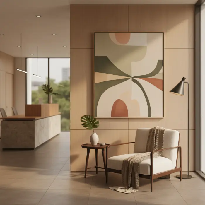
Psychologically, neutral colors such as those found in neutral colour paintings possess restorative and calming properties. According to Color Psychology, these shades lower stress responses and help establish a tranquil workspace, especially in executive offices or collaborative zones. Beige or soft gray walls punctuated by a limited accent color can transform office spaces into serene environments, enhancing employee focus and mental health. Neutral color schemes also align beautifully with biophilic design trends, bringing a sense of nature indoors without overwhelming the senses.
Leading interior designers and architecture studios increasingly recommend neutral colors for their adaptability across varied lighting conditions and workspace types—ranging from open-plan marketing firms to focused design studios and professional offices. Their versatility allows organizations to maintain visual balance, ensuring office décor complements rather than distracts from key architectural details.
Benefits of Neutral Colour Paintings in Corporate Spaces

Neutral colour paintings are more than aesthetic choices—they are strategic tools that influence the dynamics of commercial spaces.
- Employee Well-Being: Neutral color palettes promote mental health by reducing overstimulation. Employees benefit from environments that soothe rather than fatigue their eyes, leading to increased focus and reduced stress. Studies show that interior paint colors with calming qualities help prevent visual fatigue and support productive work habits. In healthcare facilities, educational institutions, and collaborative zones, neutral colors help foster a safe and supportive ambiance.
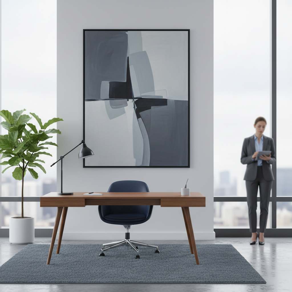
- Aesthetic Appeal and Branding: A carefully curated color scheme enhances corporate aesthetics without overwhelming the senses. The choice of neutral color paintings in office environments highlights professionalism and sophistication while allowing flexibility in adding selective accent colors that match organizational branding. Interior painting in neutral tones ensures that brand identity is consistent across different commercial spaces while supporting a positive brand perception for employees and visiting clients alike.
- Flexibility Across Spaces: Neutral colors adapt easily to a variety of workspace types—from the creative energy of media companies to the quiet focus demanded in executive offices. Office décor built around neutral artwork provides lasting visual appeal regardless of trends. For office spaces that require periodic updates to reflect changing company culture, a foundation of neutral hues allows seamless integration of new color choices or styles.
- Visual Comfort and Harmony: The interplay of light and color scheme in commercial spaces can greatly affect the overall mood. Neutral paintings contribute to visual balance, supporting the role of lighting effects in shaping client perceptions. Designers account for lighting conditions—both natural and artificial—when selecting interior paint colors and art pieces to create environments where occupants enjoy maximum comfort and visual interest.
Expert Insights and Recommendations
Seasoned interior designers and art consultants offer plenty of guidance on harnessing the power of neutral colour paintings in work environments.
- Interior Design Expertise: Selecting the perfect neutral color or artwork begins with understanding the full color wheel and applying the principles of colour theory. Designers recommend establishing a color palette with subtle contrasts—balancing neutral backgrounds with carefully selected accent colors. This approach supports both visual appeal and organizational identity. Notably, corporate office paint colors that stay within the neutral range support professionalism while remaining timeless.
- Best Practices for Selection: Consider the primary functions and audience of the space. Professional offices may benefit from minimalist, earth-toned pieces, while marketing firms and design studios might opt for neutral works with dynamic architectural details or subtle pops of accent colors. Healthcare facilities and educational institutions often prioritize visual comfort and psychological safety, making soft grays and beiges ideal choices.
- Curatorial Advice: Art consultants emphasize the need to customize according to brand identity and workspace types. Collaborate with artists or galleries offering tailored pieces and consult with specialists who understand color selection, lighting conditions, and the unique nature of biophilic design. Feng Shui principles may guide the placement of artwork to maximize energy flow and create an ambiance that supports productivity and well-being.
- Integrating Lenoir Decor Services: For organizations seeking bespoke solutions, engaging experts like Lenoir Decor ensures that the artwork is not only original but perfectly attuned to business goals and aesthetic values. By commissioning custom pieces, businesses gain creative control while benefiting from specialized guidance in color choices, artistic mediums, and presentation styles.
Practical Applications and Case Studies

Across a diverse range of industries, the use of neutral colour paintings has transformed offices and commercial environments. Here are some illustrative examples:
- Case Study: Executive Office Transformation
A leading financial firm revamped its office spaces with bespoke neutral paintings featuring layered textures in soft grays and taupes. The resulting color scheme enhanced visual comfort, reduced stress, and shifted client perceptions of the brand toward greater trustworthiness and sophistication..
- Case Study: Healthcare Facility Revitalization
A healthcare provider introduced a series of neutral color artworks in waiting and consultation areas. The biophilic design elements, combined with a neutral color palette, lowered perceived wait times and created a sense of calm for patients and staff alike. Careful attention to lighting conditions and color palettes ensured maximum impact.
- Case Study: Creative Collaborative Workspace
A marketing firm balanced energetic collaborative zones with neutral color walls and large minimalist paintings, offsetting vibrant accent colors in lounge areas. This blend of office décor maintained a cohesive brand identity while encouraging creativity without causing visual fatigue.
- Thematic and Artistic Expression
Customizing neutral art allows companies to incorporate subtle references to their core values—such as innovation, reliability, or sustainability—in visual motifs and themes. By aligning the art’s color scheme with brand perception, organizations can express their mission while improving overall workspace aesthetics.
In each scenario, businesses found measurable benefits: improvements in employee focus, enhanced brand identity, and consistently positive client feedback. Lenoir Decor's tailored art services have been instrumental for clients seeking a seamless integration of neutral colour paintings within their existing color palettes and décor.
Conclusion
Choose art that inspires—explore neutral colour paintings for your office. As companies strive for dynamic, healthy work environments, the impact of neutral colour paintings cannot be overstated. When thoughtfully integrated with professional guidance from providers like Lenoir Decor, these artworks deliver visual comfort, reinforce brand identity, and elevate everyday experience across all types of commercial spaces. Explore the world of neutral paintings today to invigorate your workspace and foster well-being throughout your team.